Type 3.2 font editor
Make a Variable Font - Part II
By Allan Murray | Posted December 5, 2019
Part I explored the basic steps involved in creating a variable font using Type 3.2 and Type light font editors.
Part II will now look at: action scripts, previewing and use, adding secondary and intermediate master outlines, axis remapping and extracting single instances from a variable font.
Note: Sections marked ** are not available in the freeware version, Type light.
Using an Action script to create master outlines**
In Part I, we used a simple skew transformation to create Oblique master outlines from the default glyph. This can also be done using a simple action script, applied to multiple glyphs.
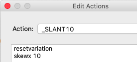
Select edit actions from the global menu, then create a new script as shown. The resetvariation command reverts the master outline back to the default glyph before applying the transformation - so if you run the script again, it won't result in a 20 degree skew.
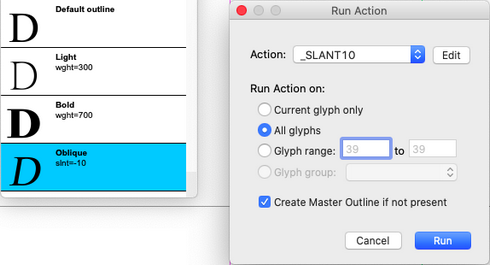
Select an already created Oblique master outline (it must be created manually first for at least one glyph) in the variable font window (make sure the default glyph is not selected - you will be warned if it is). Then click the run action button (cog symbol). Select your action, select all glyphs, and tick create master outline if not present (self explanatory). Running the script will now create Oblique master outlines for all glyphs in your font.
Previewing and using variable fonts
Type 3.2 and Type light include options for previewing variable fonts during the creation process:
Glyph Preview Window
If show variation is selected from the glyph preview window's drop-down menu, then the instance of the currently selected master outline will be previewed in the window, otherwise it will show a default outline.
Variation Viewer
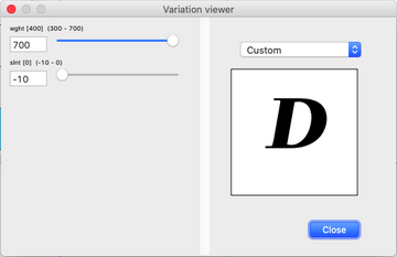
Select variation viewer from the variable font window's drop-down menu. The allows you to view the currently selected glyph at any location on the variation axes. You can select any named instance from the drop-down menu, or use the sliders to select an instance.
Full Font Preview
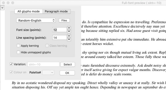
The full font preview window also has a variation viewer to select an instance for the whole preview window. Tick the variation check box then press select.
Using variable fonts
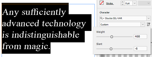
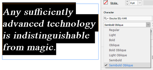
Applications supporting variable fonts1 will allow selection of any named instances in their drop-down font selector. Selection of arbitrary instances may also be possible via sliders for each axis.
Adobe InDesign variable font slider selection:
Adobe InDesign drop down menu selection of named instances:
There are also some great websites2 3 that can be used to test your variable fonts. Just drag your .ttf font file onto these web pages, and you can adjust the instance using sliders and drop-down menus.
Secondary master outlines
In Part I we defined primary master outlines at the extremes of the weight and slant axes (Light, Bold and Oblique). With just these outlines defined, Bold Oblique and Light Oblique outlines will be interpolated from these primary master outlines.
This interpolation may be sufficient at these secondary locations (where more than one axis is at an extreme), but often it will be the case that (for some glyphs at least) it may be necessary to explicitly define these secondary master outlines.
Add secondary master outlines to a glyph only after the primary ones are complete. Altering primary master outlines later may affect the shape of secondary master outlines. This dependency is indicated by an * beside the name of the master outline.
Intermediate master outlines
For each master outline, there exists a region in design space over which it has an affect. For the primary and secondary master outlines discussed so far, this region extends from the default axis value to the maximum or minimum. But a smaller region, called an intermediate region can be defined over a range of axis values.
The dollar glyph in the variable font Montserrat4, for example, uses intermediate regions to produce an apparent abrupt change in glyph shape near wght=600, where the vertical bar changes from continuous to broken.

This is achieved by inserting two master outlines very close together: one at wght=600 (with continuous bar), operating over the range wght=100 to 601, and the other at wght=601 (with broken bar) operating over the range wght=600 to 900 (notice the slight overlap - there will be a weird morphing in the overlap - so don't place a named instance there). The range of the primary master outline (at wght=900) also has been changed to wght=601 to 900.
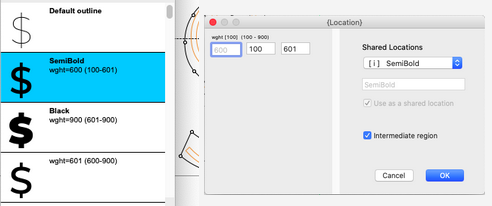
To set a range, tick the intermediate region box when editing or adding a master outline location, then enter aixs values for the start and end of the region.
Axis remapping
In our example font, the Semibold instance (wght=600) will have interpolated outlines exactly two-thirds of the way between the outlines of the default instance (wght=400) and the defined Bold instance (wght=700). But what if these interpolated outlines are too bold for Semibold, and you would like the outlines at the axis location 550 to represent Semibold instead? You can remap the user location 600 (the value that the end-user selects) to the font location 550.
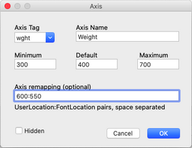
Open the axis list, select the weight entry and press edit. enter 600:550 in the axis remapping box.
Multiple entries per axis are allowed (space separated), but both the user and font value must increase for each entry, and both must be on the same side of the default value.
When an axis has remapping, a font location will often be displayed in { }'s to distinguish it from a user location. Named instances are defined at user locations, but master outlines and variable metrics are defined at font locations. If there is no remapping, then user location and font location are identical.
Extracting a single instance font**
Any named instance can be exported as stand-alone, non-variable font.
Select save glyph data from the file menu, then select generate a single instance of a variable font. Select a named instance from the drop-down menu and press ok to save it as a .gfs file. Close the variable font and open the .gfs file. Then:
- Correct any overlapping contours (you can use the glyph validation and repair functions). Overlapping contours are allowed in variable fonts, but are not allowed in standard fonts.
- Set the correct weight and width, and any required style-linking options (italic and bold checkboxes) for this instance in the font description dialog on the font menu. The correct italic angle may also need to be set in the font metrics dialog. Other variable metrics will have been interpolated during export.
Before saving the font as either .ttf or .otf file.
References:
1. https://v-fonts.com/support/
2. https://wakamaifondue.com
3. https://www.axis-praxis.org
4. https://github.com/JulietaUla/Montserrat
To post a comment email: allanmurray@cr8software.net