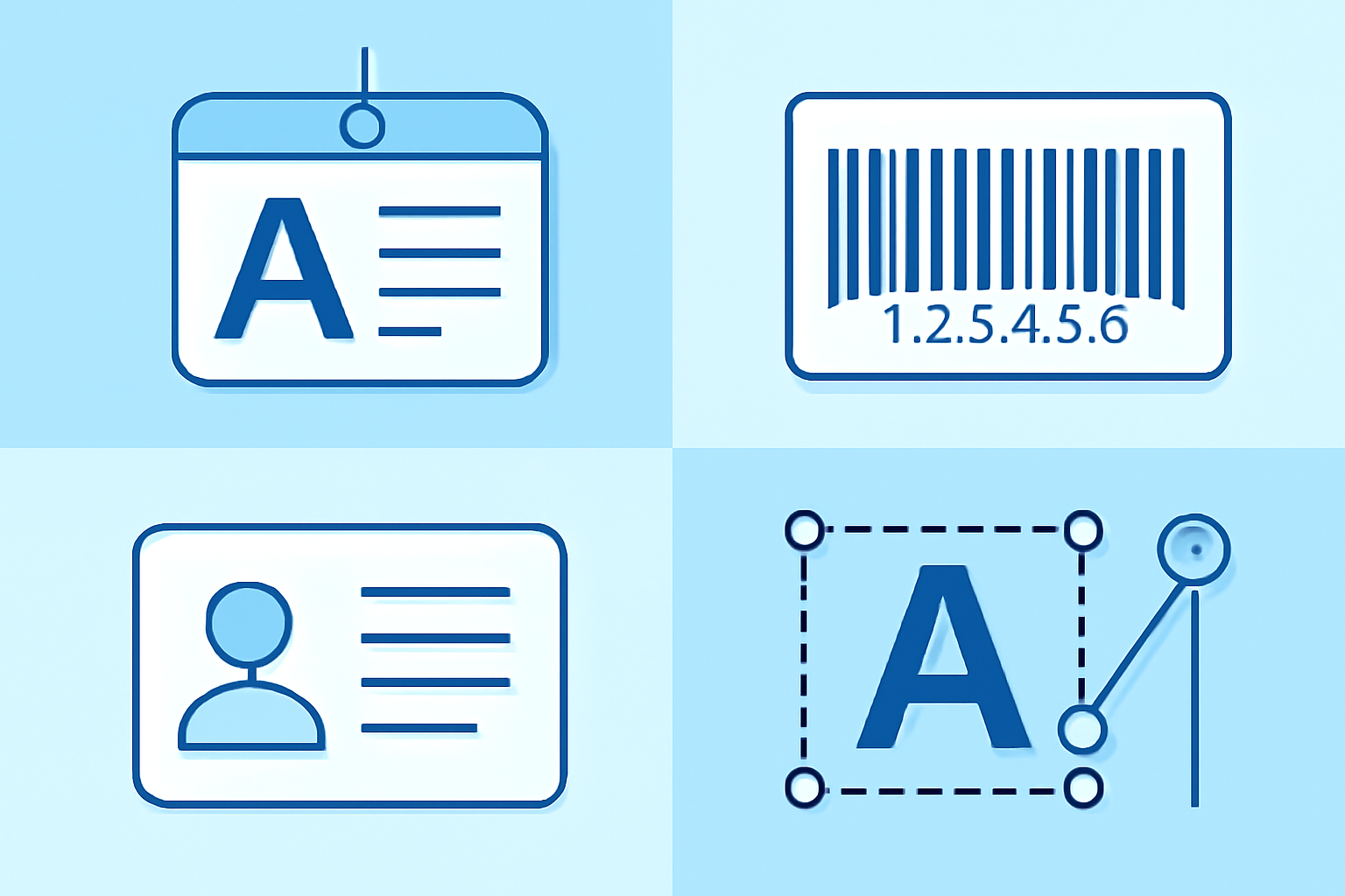
When you’re printing ID cards, badges, or equipment labels at actual size, readability collapses fast if you ignore basic typography principles. After testing dozens of badge designs in Zebra CardStudio and Avery DesignPro, I’ve learned that font choice matters more than most people realize—especially when you’re working below 10pt body text or printing on non-white backgrounds. The wrong typeface turns a professional badge into an unreadable mess that frustrates staff and visitors alike.
Most Readable Fonts for Small Print Applications
Sans-serif fonts dominate small-format printing for good reason: they maintain clarity when individual characters shrink to 6-8pt. Arial, Helvetica, and Verdana remain industry standards because their open apertures (the gaps in letters like ’e’ and ‘a’) prevent ink bleed from closing up letterforms. I’ve printed hundreds of test badges, and Verdana consistently outperforms Arial at sizes below 8pt due to its wider character spacing—though it takes up about 10% more horizontal space.
For slightly larger text (12pt and up), Franklin Gothic Medium offers better visual weight than standard Arial Bold without looking overly heavy. Avoid condensed variants like Arial Narrow on badges smaller than CR80 standard (3.375" × 2.125"); the compressed letterforms blur together when printed on textured PVC card stock.
Serif fonts fail spectacularly on small badges. Times New Roman looks acceptable on screen but the fine serifs disappear or blob together when printed at 300 DPI on thermal transfer printers. The one exception: Georgia performs reasonably well at 10pt and above for name fields, though I’d still recommend sans-serif for ID numbers, department codes, and anything printed white-on-dark.
Monospaced fonts like Courier New work brilliantly for fixed-length codes (employee numbers, facility codes) because the uniform character width prevents alignment issues across multiple cards. This matters when you’re batch-printing 200 badges and need visual consistency.
Font Size Recommendations for Different Badge Dimensions
CR80 standard cards allow comfortable 10-12pt primary names with 7-8pt for job titles and departments. Drop below 7pt and you’re gambling with legibility—acceptable for fine-print expiry dates but nothing visitors need to read from 3 feet away. I’ve tested badge visibility at reception desk distances (roughly 4-6 feet), and 10pt Arial remains clearly readable while 8pt becomes borderline.
For smaller adhesive labels (1" × 2.625" typical equipment tags), scale everything down proportionally: 8-9pt for primary identifiers, 6pt minimum for supplementary info. Anything below 6pt requires perfect print alignment and pristine label stock—not realistic in typical office environments.
Vertical badges (portrait orientation) accommodate larger fonts than horizontal layouts because you’re working with the longer dimension. A 3.5" height allows generous 14-16pt names while maintaining reasonable margins. Conference badges benefit from this orientation—attendees need to read names quickly during networking.
Barcode labels demand different sizing logic entirely. The human-readable text below Code 39 or Code 128 barcodes typically prints at 6-7pt, but the critical factor is x-dimension (bar width), not font size. For detailed barcode specifications, the GS1 standards organization provides mil thickness requirements and industry guidelines.
Contrast and Background Considerations
High contrast isn’t just aesthetic preference—it’s a functional requirement. Black text on white backgrounds provides 21:1 contrast ratio (measured in luminance), while black on light grey drops to maybe 5:1. That difference matters enormously when printing on glossy PVC versus matte card stock, as glossy surfaces reflect ambient light and reduce perceived contrast.
Reversed text (white on dark backgrounds) requires heavier font weights than standard orientation. What looks perfectly readable as black Arial Regular becomes spindly and faint as white Arial Regular on navy blue. Bump up to Arial Bold or increase font size by 1-2pt to compensate. I’ve seen this mistake repeatedly in corporate badge templates—someone designs on screen without printing test cards, then wonders why the reversed job titles look anemic.
Colored text fails more often than most designers expect. Red text on white backgrounds seems obvious and readable until you print it, then the thin strokes wash out under fluorescent lighting. Dark blue, black, and charcoal grey remain the safest text colors. If you must use color, test physical prints under actual office lighting conditions—not just under your desk lamp.
Background images and patterns wreck text legibility unless you add solid knockout boxes behind text areas. A semi-transparent white box (80-90% opacity in your design software) preserves background branding while ensuring text remains readable. This technique works well for employee badge designs that incorporate company logos or departmental color coding.
Special Characters and International Names on Badges
Standard Western fonts cover basic Latin characters, but multinational companies need proper UTF-8 font support for names containing diacritics, Cyrillic, or Asian characters. Arial Unicode MS and Noto Sans include extensive character sets, though they often increase file sizes in badge design templates—a consideration when you’re working with older Zebra or Fargo printer drivers that limit embedded font data.
Accented characters (ñ, é, ü) frequently cause print issues if your badge software doesn’t properly encode Unicode. I’ve encountered situations where CorelDRAW exports looked perfect on screen but printed as blank boxes because the printer driver substituted a different font that lacked those glyphs. Always run test prints with actual international names from your employee database, not placeholder text.
Vietnamese names present particular challenges with stacked diacritics (like ậ or ữ). Some fonts render these combinations poorly at small sizes—the marks overlap or shift position. Google’s Noto Sans handles complex diacritics more reliably than Microsoft’s core fonts, though you’ll need to install it separately on your print workstation.
For businesses managing teams across multiple locations with diverse staff, clear identification remains essential both physically and digitally. While physical badges handle in-person identification, virtual phone systems provide the communication infrastructure that connects distributed teams—another layer of identity management that complements physical security credentials.
Japanese and Chinese characters require minimum 10pt sizing even for short names due to stroke complexity. At 8pt, kanji become illegible blobs. If you’re regularly printing badges for Japanese staff, consider using a two-line layout: romanized name (10pt) on the first line, native script (12pt) on the second. This accommodates both Western colleagues who can’t read kanji and Japanese staff who prefer seeing their names correctly rendered.
Digital Font Management for Business Documents
Beyond physical badges, consistent font usage across your organization’s documents and signage reinforces brand identity. Font management tools like NexusFont (freeware) or MainType (commercial, around $60) let you preview, organize, and activate fonts without permanently installing hundreds of typefaces that slow down your system.
Corporate font licensing deserves attention too. Most commercial fonts license per-workstation, so that $199 Helvetica Neue purchase legally covers only one computer. If you’re printing badges across multiple stations or sending templates to facilities managers at branch offices, you’ll need appropriate licenses. Open-source alternatives like Liberation Sans (metrically compatible with Arial) eliminate licensing headaches for multi-user environments.
Cloud-based badge systems and virtual identification platforms increasingly handle name rendering automatically, but they still rely on proper font selection in their underlying templates. When designing badge templates for SaaS platforms like HID SAFE or Jolly Technologies BadgeMaker, verify which fonts are actually available server-side versus client-side. Not all cloud platforms support custom font uploads, limiting you to their preinstalled library.
Remote and hybrid teams present unique identification challenges that extend beyond traditional badge printing. When employees rarely visit physical offices, companies often implement digital ID solutions for video calls, email signatures, and internal directories. Maintaining consistent typography across these digital touchpoints reinforces organizational identity even when physical credentials see limited use.
Frequently Asked Questions
Q: What’s the absolute minimum readable font size for ID card printing?
6pt represents the practical lower limit for thermal transfer printers at 300 DPI when using sans-serif fonts like Arial or Helvetica. Below that threshold, individual letters lose definition and become difficult to distinguish, especially for people with vision impairments or when reading at normal badge-viewing distances. If you need smaller text for legal disclaimers or fine print, consider increasing printer resolution to 600 DPI or switching to retransfer printing technology, which produces sharper edges. Honestly, if information is important enough to include on a badge, it deserves to be readable at 7-8pt minimum.
Q: Should I use the same fonts for barcode labels and ID badges?
Not necessarily. Barcode labels prioritize durability and scanner compatibility over aesthetic consistency with ID badges. While your badges might use a corporate brand font for names, barcode labels should stick with proven performers like Code 39, Code 128, or Data Matrix symbologies paired with simple sans-serif human-readable text. Font choice for the numbers below barcodes matters less than proper x-dimension sizing and quiet zones. I typically use OCR-B or plain Arial for barcode labels because they’re universally supported across label design software, whereas specialty corporate fonts sometimes cause driver compatibility issues with industrial label printers from Zebra or Brady.
Q: Can I mix serif and sans-serif fonts on the same badge for visual hierarchy?
You can, but it rarely improves readability at badge scale. Mixing Georgia (serif) for names with Arial (sans-serif) for job titles creates visual distinction on screen, but at 10pt and below, the serif font loses clarity and the overall design looks inconsistent rather than hierarchical. A better approach: use size and weight variations within a single sans-serif family. Arial Regular at 11pt for names, Arial Bold at 8pt for departments, and Arial Regular at 7pt for ID numbers creates clear hierarchy without introducing legibility problems. The consistency also simplifies font management when you’re batch-printing hundreds of cards or coordinating designs across multiple facilities.