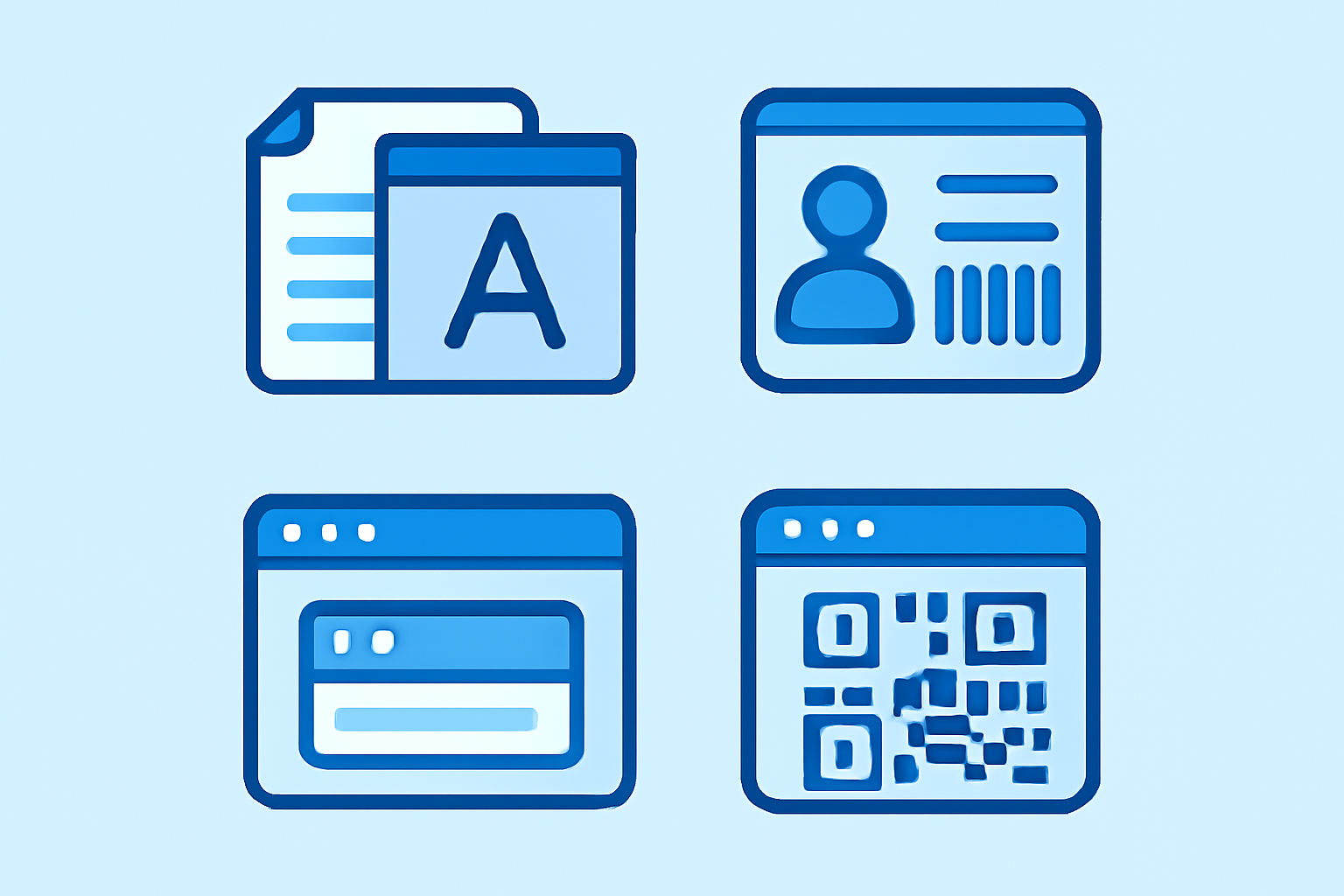
Desktop publishing doesn’t require enterprise budgets anymore. Small offices can produce professional signage, branded documents, and identification materials in-house using the same desktop tools that design studios rely on. Whether you’re printing directional signs for a new office layout or standardizing employee badge templates across departments, the right software makes the difference between amateur-looking output and materials that reinforce your brand credibility.
Essential Desktop Publishing Software for Small Offices
The desktop publishing world has changed dramatically since PageMaker ruled the 1990s. Today’s small offices need software that balances professional output with a reasonable learning curve.
Adobe InDesign remains the industry standard for complex layouts, multi-page documents, and anything destined for commercial printing. The 2024 release (version 19.x) handles variable data printing natively—essential if you’re generating personalized materials or numbered badges. InDesign’s master page system excels at maintaining consistency across document series. Subscription pricing ($22.99/month standalone, less with Creative Cloud bundles) positions it as a professional investment rather than casual tool.
Affinity Publisher ($69.99 perpetual license) delivers 85% of InDesign’s functionality without subscription costs. Version 2.3 introduced improved PDF/X-4 export and better PANTONE spot color handling. For offices producing signage, internal documents, and basic marketing materials, Affinity’s limitations rarely surface. The software reads and writes common formats (PDF, IDML, EPS) and integrates cleanly with Affinity Designer for illustration work.
Microsoft Publisher (included with Microsoft 365 Business subscriptions) fills the entry-level niche. Publisher 2024 won’t impress design professionals, but its template-driven approach suits offices where non-designers occasionally need to produce materials. The built-in business card and sign templates get you 80% of the way to finished output. File compatibility remains Publisher’s weakness—exporting to PDF preserves layouts, but round-tripping files with print vendors often requires Adobe formats.
Scribus (free, open-source) deserves mention as the zero-budget option. Version 1.6.x finally stabilized professional features like CMYK color management and proper PDF/X-3 export. The interface feels dated compared to commercial alternatives, and font handling on Windows occasionally frustrates, but Scribus produces legitimate print-ready files. I’ve used it for internal signage projects where budget constraints trumped workflow elegance.
For offices already invested in ID card printer hardware, most badge design software bundles basic layout tools. These specialized applications handle card-sized layouts efficiently but lack flexibility for larger format work.
Designing Office Signage and Wayfinding Materials
Office signage demands clarity over creativity. Your desktop publishing choice matters less than understanding practical printing constraints.
Most professional signage uses 36" × 48" poster boards or smaller desk signs at 8.5" × 11". Set up your InDesign or Publisher documents at actual size—designing at half-scale then enlarging causes font rendering issues and unexpected bleed problems. For directional signs, body text below 18pt becomes unreadable from typical viewing distances (6-10 feet).
Resolution and image requirements differ dramatically from screen-focused work. Signage printed on office color lasers needs 300 DPI image resolution minimum. Large-format inkjet printing (24" or wider) tolerates 150 DPI because viewing distances increase proportionally. Vector text and logos scale infinitely—rasterize only when absolutely necessary for special effects.
Color mode matters more than most offices realize. Desktop laser printers use CMYK (cyan, magenta, yellow, black) internally but often accept RGB documents, converting colors during the print driver stage. This conversion produces unpredictable results with branded colors. Define your company colors as CMYK values in your document from the start. If your brand guidelines specify PANTONE colors, convert them to CMYK equivalents for desktop printing, or budget for spot color printing at professional print shops.
Bleed and safe areas apply even to documents printed on office equipment. Set 0.125" bleed on all sides for anything you’ll trim to size. Keep critical text 0.25" inside the trim edge—this “safe area” accounts for cutter variance and handling tolerances. Affinity Publisher’s master page templates can embed these guides permanently.
Large format work often gets outsourced to print vendors, but barcode labeling systems for inventory management typically print in-house on dedicated label printers. The layout principles remain consistent: adequate contrast, appropriate sizing for scanning distance, and proper resolution.
Template Systems for Consistent Branding
Template systems prevent the slow degradation of brand standards that plagues growing offices. When five different people create signage over three years, visual consistency evaporates without structural controls.
Master pages and paragraph styles form the foundation of any template system. In InDesign or Publisher, master pages define recurring elements—headers, footers, logo placement, color bars. Create separate masters for different document types: landscape signs vs. portrait, single-page vs. multi-page. Paragraph styles control typography: one-click formatting that enforces font families, sizes, leading, and color. The upfront investment pays off when someone needs to update 50 office door signs—changing the master page updates all derived documents instantly.
Color swatches and brand palettes should exist as named swatches in your template files, not arbitrary RGB values picked from screen. Add your company’s primary and secondary colors, approved tints, and any special colors for departmental materials. InDesign supports Adobe Swatch Exchange (.ase) files—create one master palette file and load it into every document.
Asset libraries keep logos, approved photos, and icon sets accessible. InDesign’s CC Libraries sync across installations if your team uses Creative Cloud. Affinity Publisher uses embedded assets—less elegant but functional for smaller teams. For offices using Publisher, maintain a network folder with locked PDF versions of logos and standard graphics. Lock files as read-only to prevent well-meaning modifications.
Variable data capabilities extend templates into personalized territory. Mail merge functionality in Publisher handles basic personalization (names, addresses) from Excel spreadsheets. InDesign’s Data Merge panel supports more complex scenarios—employee directories where each page pulls different information from a CSV file. This same approach works for employee badge templates, generating unique cards from a database of staff information.
Template discipline requires enforcement. Lock down master copies on network drives with read-only permissions. Train staff to “Save As” working copies rather than modifying originals. The ten minutes spent establishing file permissions prevents hours reconstructing corrupted templates.
Printing Labels, Tags, and Identification Materials
Desktop publishing software handles identification materials differently than page-based documents. Label and badge printing introduces technical constraints around physical dimensions, material substrates, and printer capabilities.
Specialty paper stocks require precise document setup. Avery label sheets (common for address and shipping labels) provide free templates for Word and Publisher, but InDesign users need manual setup. Measure actual label dimensions including spacing—Avery’s published specs occasionally differ from physical sheets by 0.5mm, enough to cause alignment problems across multi-up layouts. Create test prints on plain paper, overlay them on actual label stock against a window, and adjust margins before committing to expensive specialty media.
PVC card stock for ID badges measures 3.375" × 2.125" (CR80 standard). Most desktop publishing software lacks preset templates for this size. InDesign’s custom page size dialog handles it cleanly; Publisher requires fiddling with custom paper definitions in printer properties. Font selection for small badges demands testing—what looks crisp on screen at 8pt often renders muddy on actual cards at 300 DPI.
Barcode integration separates professional systems from amateur efforts. InDesign natively generates EAN-13, UPC, and QR codes through Object > Generate QR Code menu. For Code 128 or more specialized symbologies, third-party plugins like Softmatic’s Barcode Tools ($49.95) add industrial barcode types. Publisher lacks native barcode support—you’ll generate codes through standalone utilities and import them as images.
Many offices now coordinate physical identification materials with digital systems. When you’re printing employee badges with contact information, consider including QR codes that link to digital contact cards or internal directory pages. For businesses managing distributed teams, these physical materials often bridge to virtual phone systems where staff maintain separate business lines without carrying multiple devices. The desktop publishing tools that create your badges can embed QR codes pointing to these virtual contact systems—a practical integration that simplifies how team members share business contact details.
Printer driver settings matter more than most users realize. Desktop inkjet printers often default to “best” quality mode that over-saturates colors and causes bleed-through on badge materials. Switch to “normal” quality and enable manual color correction. For laser printers handling labels, reduce fuser temperature settings if adhesive bleeds around edges—consult your printer’s manual for media-specific temperature adjustments.
Coordinating Print and Digital Communication Materials
Modern offices blur boundaries between printed materials and digital channels. Desktop publishing tools increasingly serve as design origins for omnichannel content.
PDF export quality determines whether your printed materials translate successfully to digital distribution. InDesign’s PDF presets include “High Quality Print” (maintains full image resolution, CMYK colors) and “Smallest File Size” (compresses aggressively for email). Office signage files exported for archive should use PDF/X-1a or PDF/X-4 standards—these ISO-certified formats embed all fonts and preserve color profiles. The exported PDF becomes your distribution master, usable for both reprinting and screen viewing.
QR code integration bridges print and digital naturally. Employee badges, office signage, and product labels increasingly include QR codes linking to internal wikis, safety documentation, or equipment manuals. InDesign’s native QR generation creates vector codes that scale cleanly at any size. Encode URLs, vCard contact information, or plain text—test scan distance during design. QR codes smaller than 0.75" × 0.75" create scanning problems beyond 12 inches.
Digital signage repurposing extends desktop publishing files into screen-based displays. Most corporate digital signage systems accept PDF or image inputs. Design your desktop-published signage at appropriate aspect ratios (16:9 for most displays), export as high-resolution PDF, then convert to PNG or JPG for digital display systems. Maintain separate master files—printed signage needs higher resolution and different color profiles than backlit screens.
Style guide documentation should exist as desktop-published PDFs, not buried in email threads. Create a brand standards document using your template system, covering logo usage, color values (RGB, CMYK, and HEX for web), approved fonts, and sample layouts. Export as an interactive PDF with bookmarks for easy navigation. Update quarterly as standards evolve.
Version control becomes critical when coordinating print and digital materials. File naming conventions should include version numbers and dates: “office-signage-directional-v3-2024-01-15.indd” beats “NEW final FINAL actual final v2.indd” every time. Network folders with dated archive subdirectories prevent confusion when someone needs to reprint last year’s materials.
The workflow integration between desktop publishing and business communication systems improves constantly. Modern offices coordinate everything from physical security badges to virtual business phone numbers through interconnected platforms. Desktop publishing sits at the center—creating the visual materials that represent your organization across physical and digital spaces.
Frequently Asked Questions
Q: Can I use Microsoft Word instead of dedicated desktop publishing software for office signage?
Word handles basic single-page signage adequately but lacks professional print controls. You can’t set proper bleeds, manage CMYK color spaces, or create reusable master page templates. For occasional internal signage printed on office equipment, Word suffices. For anything representing your organization to clients or requiring commercial printing, invest in Publisher ($99/year with Microsoft 365) or Affinity Publisher ($69.99 one-time). The output quality difference becomes obvious once you compare side-by-side prints—proper desktop publishing software produces sharper text, better color accuracy, and more consistent results across multiple print runs.
Q: What resolution should I use for office signs printed on large format inkjet printers?
Set images to 150 DPI minimum for large format printing (24" wide or larger). This seems counterintuitive compared to desktop printing’s 300 DPI standard, but viewing distance compensates. A 36" × 48" poster viewed from 6-10 feet doesn’t require the same resolution as an 8.5" × 11" document viewed from 12 inches. Keep all text and logos as vectors when possible—they’ll scale infinitely without resolution concerns. Only rasterize elements when applying special effects like drop shadows or transparency blends. Test print a small section before committing to expensive large format output, and verify colors match your expectations under your office lighting conditions.
Q: How do I maintain brand consistency when multiple people create materials using templates?
Lock master templates as read-only files on network storage and require staff to “Save As” working copies to personal folders. Implement a review workflow where someone checks materials before printing—even ten minutes of spot-checking catches most deviations. Create detailed template documentation with annotated screenshots showing which elements to modify and which to leave untouched. Consider designating one person as template custodian—they handle updates, answer questions, and maintain the master library.